
Challenge
Modernise a heritage brand without losing its authenticity. The range needed to become clearer and more desirable while preserving familiar consumer cues.

Coffee & heritage
A warm range that modernises historic coffee codes without erasing its character.
Range architecture
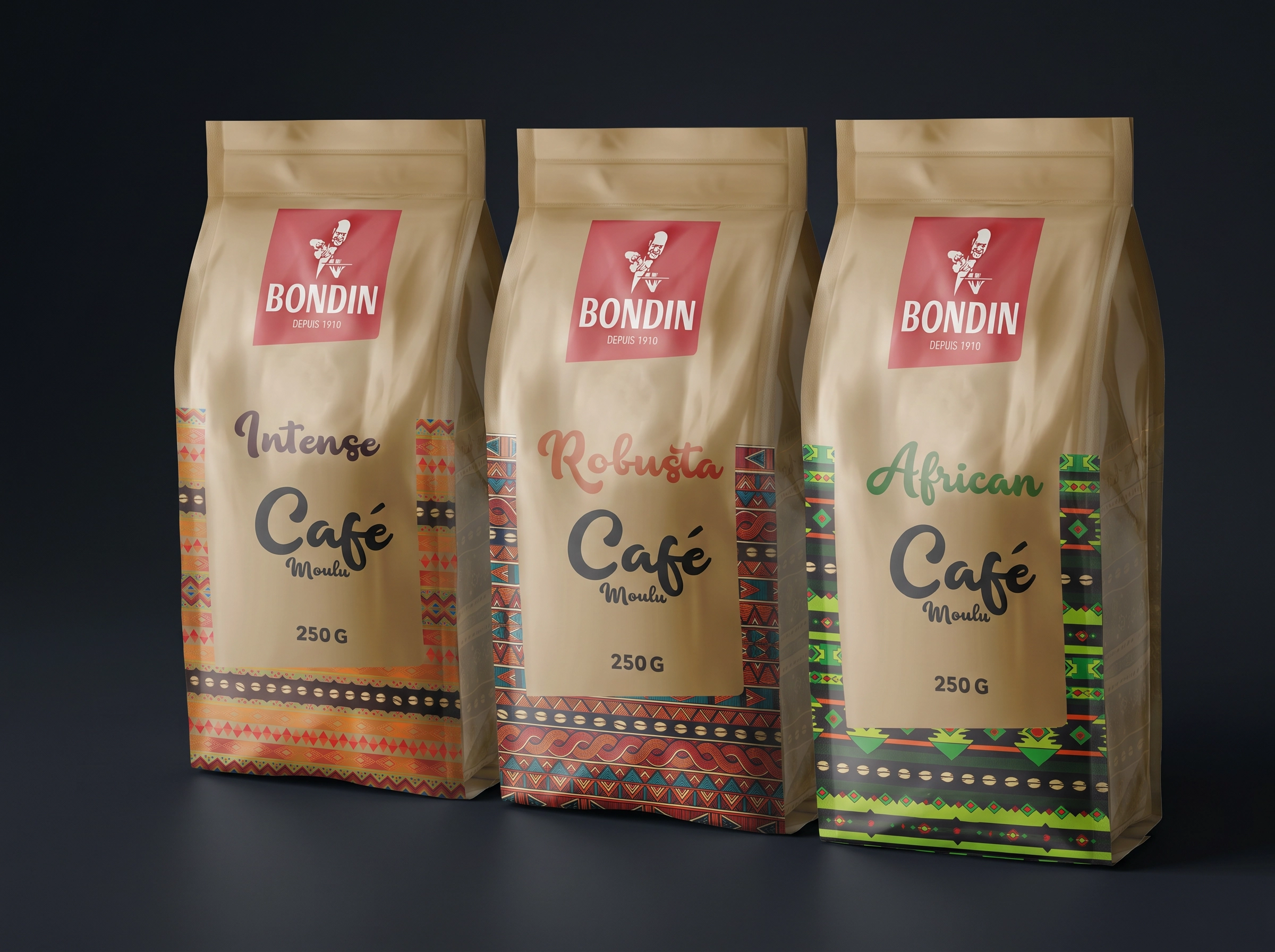
Each reference owns its intensity while remaining immediately connected to the brand.

Graphic origin
Patterns and textures create a world of travel, materiality and roasting.

Instant reading
The hierarchy clarifies variants and strengthens the range on shelf.

Everyday ritual
Packaging turns a familiar product into a richer, more generous and more memorable experience.
A coffee range bringing heritage, intensity and visual warmth together in a clearer, more contemporary system.
Bondin
DCD
DATEM
Range architecture
Packaging design
Visual system
The project does not erase Bondin’s heritage. It reorganises it. Historic cues are combined with a stronger range structure, origin-inspired patterns and a colour presence that makes each reference easier to read.
The system creates consistency without flattening the different intensities across the range.
Bondin keeps the warmth of an established brand while giving every reference a clear role within a more contemporary whole.
Modernise a heritage brand without losing its authenticity. The range needed to become clearer and more desirable while preserving familiar consumer cues.
We built a stable architecture: strong branding, a colour code for each reference, origin-inspired patterns and simplified product hierarchy. Every element helps choice without breaking the historic personality.
The range gains consistency, recognition and readability. Bondin can extend its offer more easily while retaining an immediately identifiable brand presence.
DCD identifies the most useful coffee-category cues: authenticity, intensity, origin and trust. DATEM translates them into warmth, travel and generosity. Packaging becomes both a navigation tool and an emotional trigger.
This project illustrates our holistic approach to brand design: strategy, visual identity, art direction and consistent rollout across touchpoints.


