Challenge
How could an olive oil draw a distinctive visual identity from its maritime heritage and encourage people to explore the entire range?
One ship across three bottles
Three bottles, one ship.
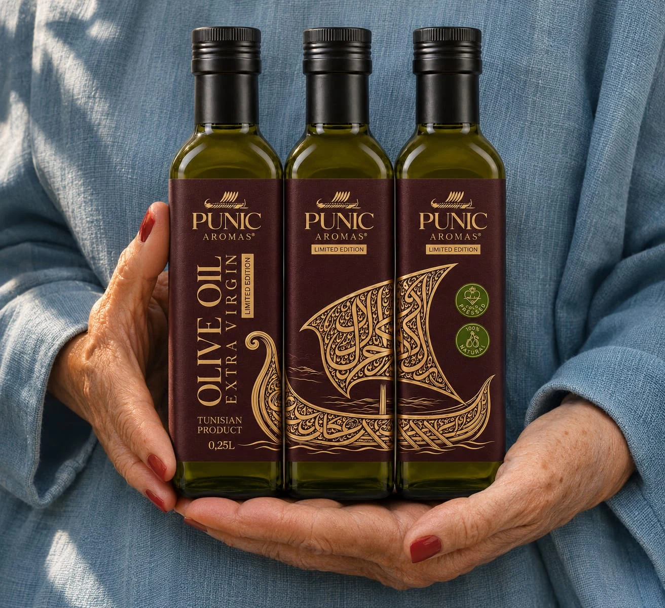
The range in hand
The range in hand
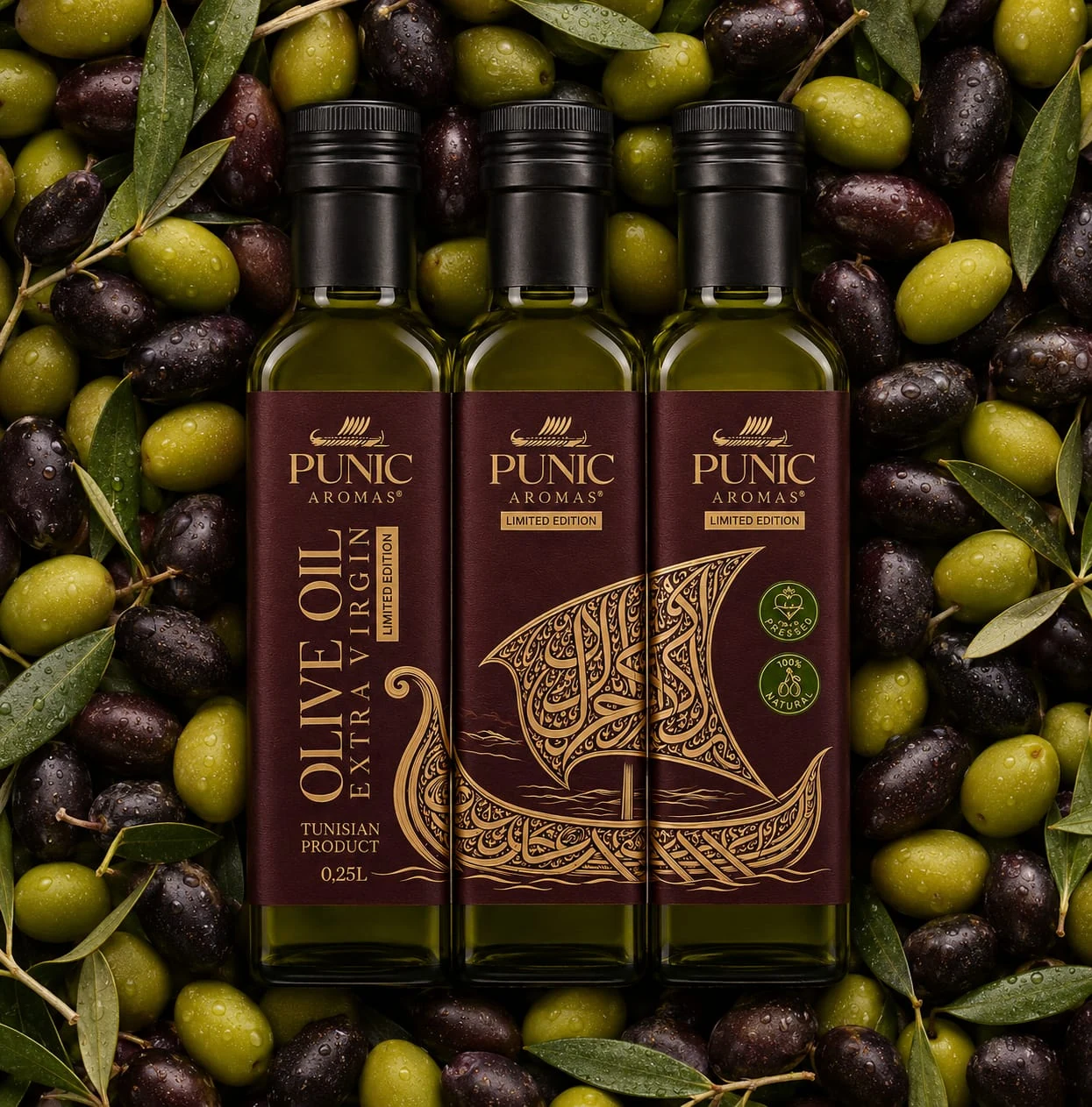
Olive oil and visual origins
Olive oil and visual origins
Three bottles, one ship.
Punique
DCD
DATEM
Visual identity
Packaging design
Art direction
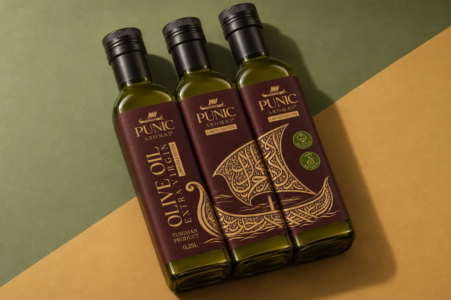
The Punic labels come together to reveal a ship inspired by Punic maritime heritage. Each bottle carries part of the drawing and has its own clear hierarchy.
The Punic labels come together to reveal a ship inspired by Punic maritime heritage. Each bottle carries part of the drawing and has its own clear hierarchy.
How could an olive oil draw a distinctive visual identity from its maritime heritage and encourage people to explore the entire range?
We divided the ship across three labels. Gold lines flow across the bottles over a deep brown background, while the name and oil designation remain legible on every unit.
The image rewards a closer look when the bottles sit together. It gives the range a reason to be displayed as a group on shelf, in a gift set or on a product page.
DCD looks at the packaging on two scales: the individual bottle and the complete range. DATEM gives form to curiosity and a sense of travel through an illustration revealed as the bottles come together.
We create identities and packaging that turn origin, terroir and know-how into distinctive brand stories — designed to build desire, create a premium presence and help the brand grow internationally.
The image rewards a closer look when the bottles sit together. It gives the range a reason to be displayed as a group on shelf, in a gift set or on a product page.
BACK TO PORTFOLIOThis project illustrates our holistic approach to brand design: strategy, visual identity, art direction and consistent rollout across touchpoints.