
Challenge
How could an architectural reference become a distinctive sign across containers designed for very different ways of using olive oil?
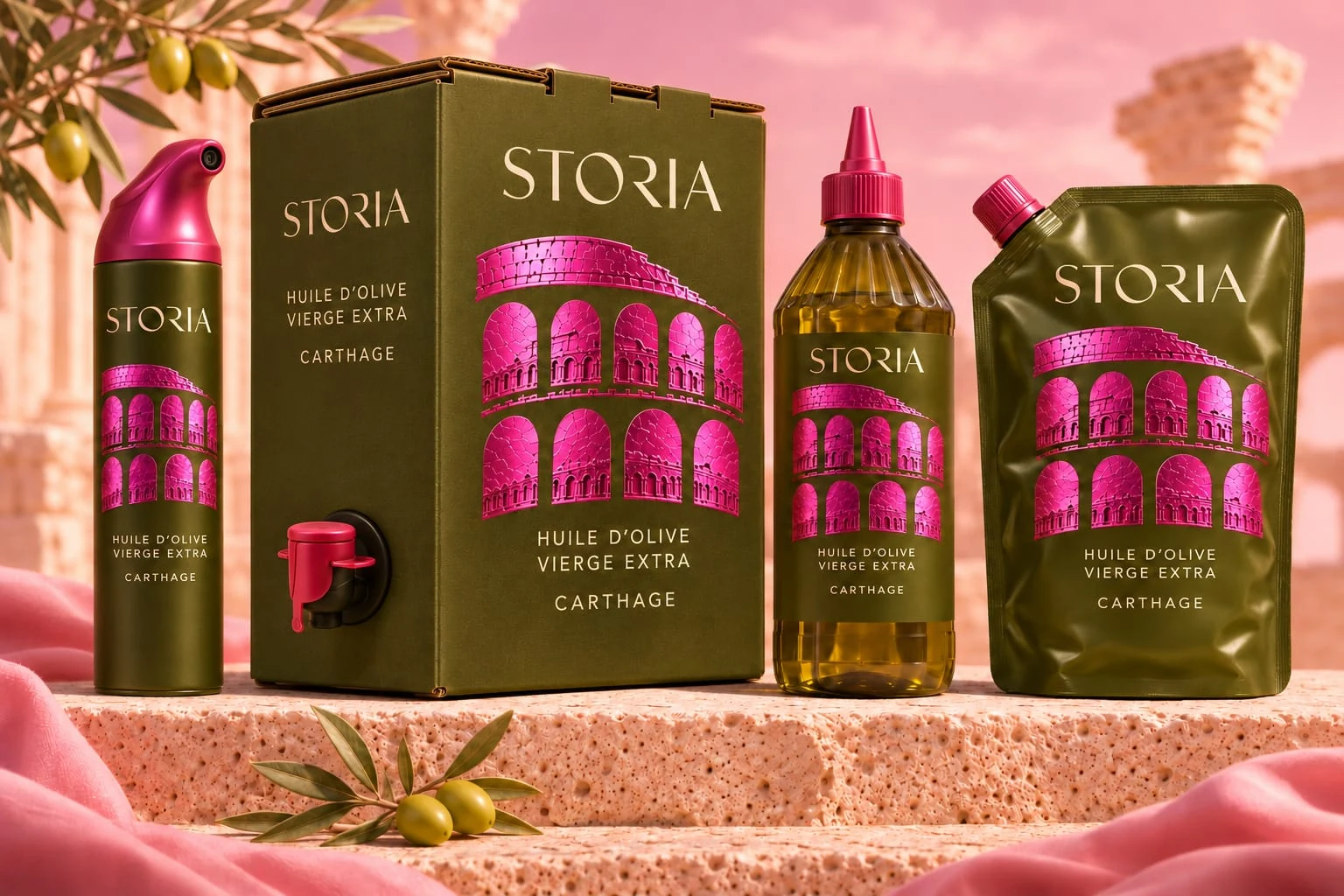
The Storia range
Classical arches in vivid pink.
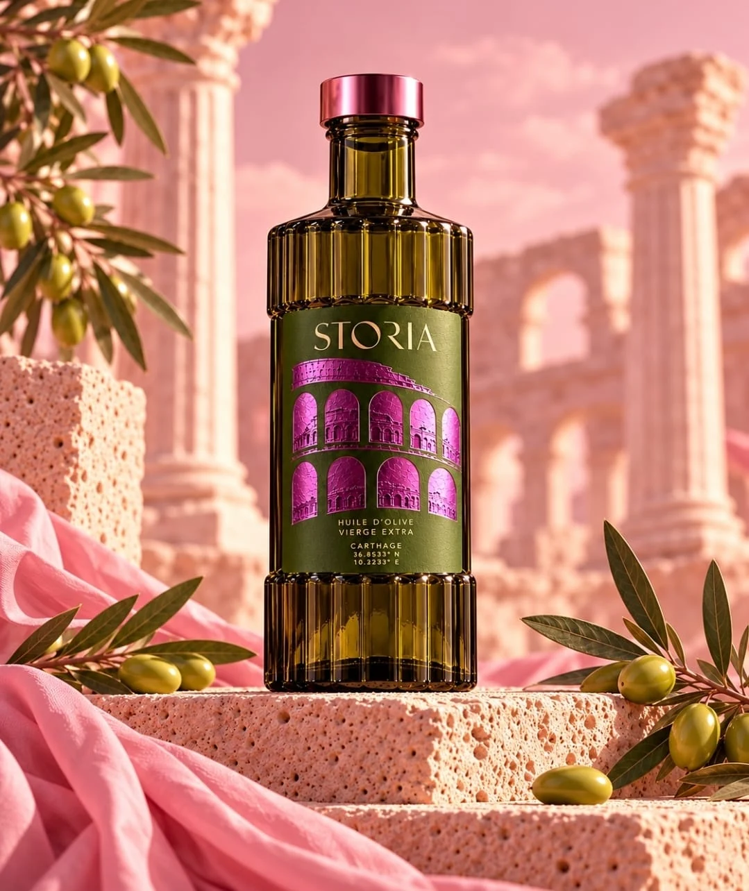
The sculpted bottle
The sculpted bottle
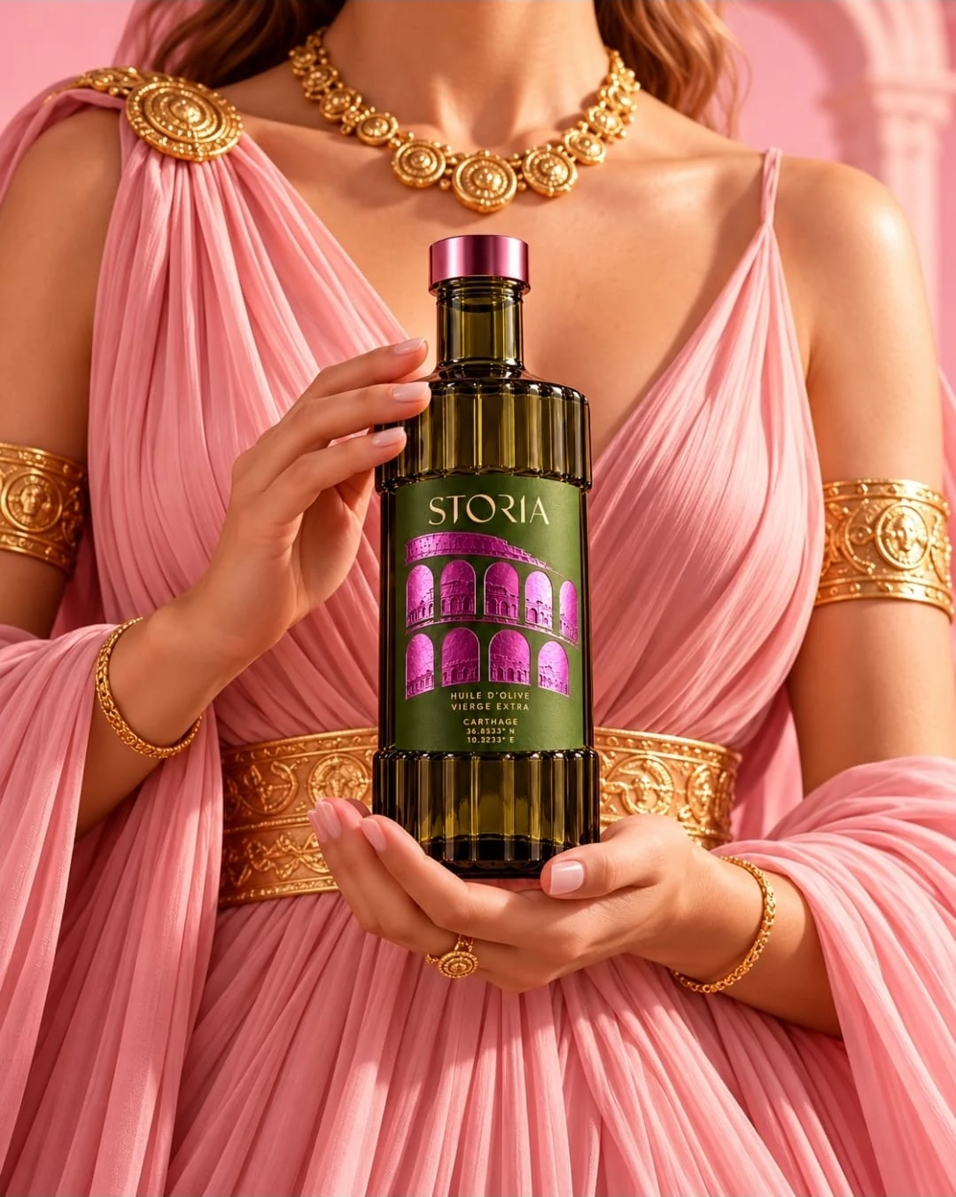
The Storia setting
The Storia setting
Classical arches in vivid pink.
Storia
DCD
DATEM
Visual identity
Packaging design
Art direction
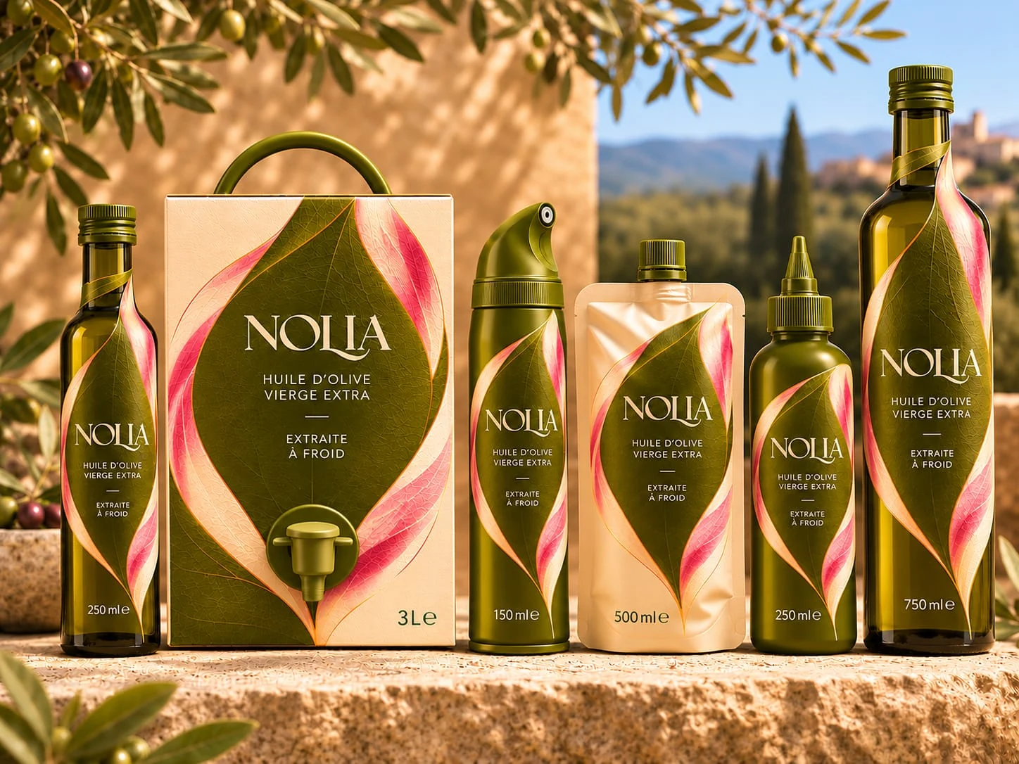
Storia turns the classical arcade into the signature of an extra virgin olive oil. Metallic pink against olive green gives the architectural motif a strong presence across the range.
Storia turns the classical arcade into the signature of an extra virgin olive oil. Metallic pink against olive green gives the architectural motif a strong presence across the range.
How could an architectural reference become a distinctive sign across containers designed for very different ways of using olive oil?
We carried the rhythm of the arches into the illustration and the relief of the bottle. On the spray, bag-in-box, squeeze bottle and pouch, the same motif and colour contrast tie the formats together.
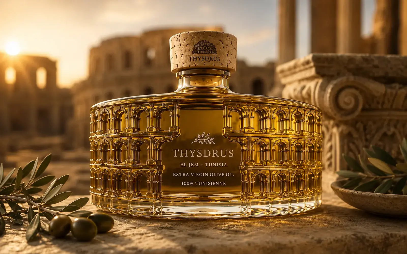
The sculpted silhouette gives the bottle its character, while the arches identify Storia on the other containers. The range can expand while retaining its signature.
DCD connects brand recognition with clarity of use. DATEM expresses a sense of scale and energy through repeated arches, sculpted relief and vivid pink.
We create identities and packaging that turn origin, terroir and know-how into distinctive brand stories — designed to build desire, create a premium presence and help the brand grow internationally.
The sculpted silhouette gives the bottle its character, while the arches identify Storia on the other containers. The range can expand while retaining its signature.
BACK TO PORTFOLIOThis project illustrates our holistic approach to brand design: strategy, visual identity, art direction and consistent rollout across touchpoints.